5/07/2009

William Eggleston

Dust Bells volume II

Untitled

Untitled Dust Bells volume II


William Eggleston
William Eggleston, whose work was inspired by the work of Robert Frank,. Much like Frank Eggleston did not photograph predictable things. Eggleston most commonly photographed signs, telegraph poles, parking meters and posters. The photographs I have chosen from Eggleston’s collection do include people this is because people interest me.
The first photograph from ‘Dust Bells II’ reminds me of Franks photograph ‘Butte , MT’ which features a family in a car. The car has two teens in eating some sort of fast food. This reminds me of when I first got my car all I wanted to do was drive all the time! The car looks new for the era, the couple could be on a date and the male could be showing off his new car. I love how the identities of the pair featured are not fully revealed this is done by the use of the above angle; this made me wonder what the pair were like. By using this angle Eggleston opens up the rest of the landscape surrounding them. This photograph has a feel good feel and reminds me of young love.
The second photograph ‘Untitled’ is clearly from the 60’s era, this is shown through the car and how the female is dressed. I love how casual this shot is, the female looks completely relaxed. The model looks young and as though she is enjoying life. I like the amount of blue in the composition gives the photo a calm feel. The circular shape of the wheel works nicely with the square shape of the car door. The door also creates a perspective point and keeps the eye on the female.
The final photograph from ‘Dust Bells II is truly beautiful. The composition is very visually interesting; this is shown through the similarities of colour throughout the composition. The female, who looks fairly young, wears an orange dress which blends into the brick work in a beautiful way. What makes the female stand out from the brickwork is the vertical lines on her dress and the shadow behind her. She appears to be under a street lamp this is shown through the dark area on the left hand corner and the shadow behind her. It almost looks as if the female has done this as an act to be invisible. This could be as she is not stick thin or popular; I think almost every girl has once felt the same. This photograph makes me wonder why she is standing alone in the middle of the night. I like the use of the landscape here I think it makes the photograph more meaningful and unique which works with the message decoded from the photograph. In conclusion Like Robert Frank William Eggleston looks for the things the world do not see or the moments that seem ordinary.


Robert Frank

Mary 1957
Political rally , Chicago
Butte , MT

Robert Frank
Robert frank, a spectacular film photographer, is best known for his series ‘The Americans’ in which I have shown above. In discourse we watched a short documentary film on him which was the only documentary he had done and his last. In the film Frank talks about his life in America and living with his wife June Leaf who made sculptures for a living. The couple have a beautiful bond and it was lovely to see how happy they made each other. As Frank talks about his work he describes how things used to be and explained how he would go out for hours and waits for the perfect frame. His passion for the subject is very clear.
In the first photograph ‘Mary 1957’ was very surprising to me when I first saw it. What strikes me about this photograph is how the shadow casts across ‘Mary’s’ face. The model is very attractive however with the shadow across her face it almost gives her another persona. What I love about Frank is his confidence and his unpredictable compositions. Any other photographer would have not taken this shot or taken it without the shadow. This shows his love for photography as he is more concerned with creating and interesting composition than photographing a pretty woman. The tones in this photograph contrast really well and the shadow helps to tone down the strong light on the face. I love how the waves are softly coming in it gives the image a tranquil feel. The flower in the woman’s hair also emphasises the calm feel as it can be linked to the ‘hippy fashion’. The shadow looks as if it is a person; this could well be Frank himself. This could also be a representation of being controlled as the shadow could represent a part of her that she doesn’t reveal or a person controlling her life.
‘Political rally, Chicago’ really made me laugh! I love Robert Franks way of making something serious comical. Again you would think Frank would be on a documentary shoot photographing crowds but instead he focuses on this man with a trombone in front of him, I think its hilarious. Frank really has an eye for capturing moments and sights everyone else walks past. The composition is perfect as the political event can be decoded from the flags in the top of the photograph. I love the grainy texture of the wall it really brings out the man with the trombone. As the viewer I am intrigued to know what this man is like.
The final photograph ‘Butte, MT’ is one of my favourites of Franks, the angle is perfect and I love how the shape of the car pushes the eye across the frame. The family make no eye contact with Frank which I think is magical. The family look lower class to middle class. They all look in the same direction which suggests they are looking at an ongoing event. Again Frank does not focus on this he focuses on the people and their expressions. The black and white works nicely here, in modern photography this in colour would be too much for the viewer to take in. since looking through Frank’s work I have developed a liking to him and they way he sees the world. I find him beautiful.

Semiotics

colour chart
Tea cup
Roland Bathes


Semiotics in Photography .
When I first started learning semiotics one of the things I remember is being faced with a photograph of a chair and being asked what is this? And we all said it was a chair. When being told we were wrong we wall all puzzled until it was made clear that the object we were being shown was a photograph of a chair, rather than a chair itself. For example if showing tea cup (above) to someone they would say it was a cup but it would be a picture of a cup, an example of a cup.
It was Roland Bathes, who came up with the theory of semiotics,

‘Semiotics, semiotic studies, or sociology is the study of sign processes (semiosis), or signification and communication, signs and symbols, both individually and grouped into sign systems. It includes the study of how meaning is constructed and understood’.

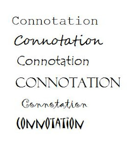
Barthes’s is best known for his book Mythologies.The book is about connotations and codes. Bathes studied the sign process and did extensive research on how meaning is constructed. For example when looking at the different fonts in the photograph above each convey a different mood or convention. The joined handwriting, second down, has a very welcoming feel to it as compared to the last font which is very obscure and could put a reader off. The same theory can be related to colors as they all have different connotations. For example red is , love , passion , danger , stop , blood , death , glamour ect and blue is calm ,tranquil , peaceful and relaxing . Colour can affect our opinion on products which is why the media have to think about how to attract their audience. For example a print advertisement for a children’s cereal will be in bright colours and be very welcoming as children appeal to this. If the cereal was black it would put the buyer off and make them think badly of the product. In conclusion semiotics has become a huge part of our society especially where the art and media worlds are concerned.
links

Postmodernism

'Andre Kertesz Distortion #49 1933'
Jo Spence ' I cant remember my name'

Postmodernism and Photography

Definition of postmodernism,

‘Of or relating to art, architecture, or literature that reacts against earlier modernist principles, as by reintroducing traditional or classical elements of style or by carrying modernist styles or practices to extremes.’

To me postmodernism evolved from the modernist period in which in music and art the boundaries were pushed and broken. Artists and photographers no longer wanted to be restricted by the’ rules’ of the art world, you could say. Therefore they become modernist and created new ideas and concepts. Postmodernism is combining old methods of working with modern forms, taking and borrowing. Now there are no limits on what art and photography can do and the boundaries are created by the photographer or artist.
An example a modernist piece would be the work of Andre Kertész whose distortion series went against all the rules of taking a traditional photograph. The photograph that could have been a traditional nude has been transformed to a surreal masterpiece. I really like this photograph as it differs from the work of that era being very traditional. Kertész almost creates a new life form with his distorted photographs and it would have been a surprise to the viewer at the time.
An example of a postmodern piece is the work of Jo Spence who combined black and white film and colour photography in her montage ‘I can’t remember my name’. The film photograph is very classic and In terms of composition it is technically perfect. The colour photographs on the other hand are almost taken like quick snap shots on a disposable camera. I love the contrast and in a way this photograph can be used as an example of how photography has progressed over the years, to having to develop photographs and having them instantly. The colour photographs have a strong link. However they are all taken in different ways be it angles, lighting or point of view this can be linked to postmodernism as the boundaries of what makes a series work. I love how the photographs are set out in no complete order which sums up the art world at the moment, there are no restrictions. Interestingly the only photograph that is straight is the film photograph; this could be a demonstration of modernism and breaking the boundaries of photography. The sentence written over the body ‘how do I begin to take responsibility’ could be a reference to the female figure in the black and white photograph. The title of the photograph ‘ I can’t remember my name ‘ really made me think about what the photograph meant and what it meant to Spence. Again her title could be a reference to the ever changing trends in the art world but I can’t help to think it means something more.


Links

Feminism

' Untitled #03 1977'
'Untitled #06 1977'

'Untitled #50 1979'

Feminism- Cindy Sherman
Cindy Sherman’s self portraits link to the subject of feminism. The photographs consist of staged self portraits and film stills. In many of Sherman’s films she played the role of the ‘femme fatal’ and was made to look venerable. In other films Sherman played the role of a sex symbol and the role of the domestic goddess, cooking and cleaning. Sherman’s roles varied but each was revolved around the male form. Sherman’s series of black and white film stills were taken from (1977-1980) at a time where the world was still over dominated by men. I admire Sherman for her confidence and realisation of equal forms. Now in a growing feminist society Sherman’s work will be idolised and used as an example of how male dominated the world once was.
Sherman said,
“I’m trying to make other people recognize something of themselves rather than me.”
I think this quote says a lot. I can imagine women seeing her portraits and thinking what role they play in life or rather what role of Sherman’s they play. All of Sherman’s portraits are ‘Untitled’ I Iove how this effects the photographs. By not naming the photographs this says to me that there is no true identity of women it’s her own decision and she makes what she makes of it. When looking at a Sherman portrait two people will not always have the same ideas and ideals. These ideas could have been swayed with a name to a photograph. For example if a photograph was called ‘Helpless’ the viewer would use that to influence their thoughts. Although a lot of Sherman’s roles were evented women know them and can associate with them. I guess you could say they saw themselves in Sherman’s many roles.
Another aspect of Sherman’s self portraits or film stills is there are never any men involved in the photographs, which I think works really well.
The first photograph ‘Untitled #03 1977’ Sherman plays the role of the domestic goddess in the kitchen cooking and cleaning and waiting for the male figure to come home. When I look at her expression I get a sense of nervousness she looks a little worried. This could be for any reason and as she looks out of the frame it gets the viewer questioning her expression and what she is looking toward. In a way you could say she looks fed up with her life like she has another purpose, a dream. She looks very young here which could suggest she married young and hasn’t had a chance to have much of a life. I like the cropping here as it doesn’t give too much away.
The second photograph ‘Untitled # 06 1977’ shows Sherman lying on the bed. She is in lingerie which would appeal to the male viewer. Here Sherman is being used as a sex symbol to attract male viewers to the film. Sherman plays a well off character here; this is decoded by her surroundings and glamorous look. Sherman holds a mirror in her hand which shows she is image conscious. Almost every woman can appeal to this portrait! There is not expression in Sherman’s eyes she almost looks doll like which could suggest that she is just a construct or stereotype. Sherman is dressed up which could suggest she is a house wife and is waiting for her husband to get home. The bird’s eye view angle gives innocence to the photograph and forces the viewer look down on her.
The final photograph ‘Untitled #50 1979’ shows Cindy Sherman in a more masculine role playing a strong and powerful women. This is encoded by her posture and style. Her hair says a lot about here whereas in the other photograph she was made to look cute and innocent here she looks bold and confident. I think the time period had a lot to do with how women were represented as compared to the other two film stills which had been taken 2 years before. Her role can also be matched with her surroundings for example here she is in a modern room with bold furniture as compared to ‘Untitled #6 1977’ where Sherman is surrounded by flowers and soft surroundings. Sherman sits in a confident a suggestive position she looks as if she is there to manipulate the male and get what she wants. I love seeing Sherman in this role and I’m sure many other women do!


Links

5/06/2009

Richard Billingham


Richard Billingham
Richard Billingham is a documentary photographer. I discovered him when I was researching for my intimate life project. This for me was the best work produced my Billingham. The work was personal to him as it was his father was the main subject in his photographs. The book published was called ‘Frank’s a laugh’ . Billingham’s father was an alcoholic and was not in a correct mental state. The sarcastic name of the book itself show s Billingham’s lack of respect for his father as he obviously hasn’t been around to be a role model for his son. I really get a sense of realism from these photographs I can imagine myself being in the room and feeling very uncomfortable. Unlike the work of Walker who creates fantasy worlds Billingham shows it how it is. In a way I like the confirmation of being put in the moment and imagining how his parents live but on the other hand I feel am I too close?

Richard Billingham (quote) :
'my father raymond is a chronic alcoholic.he doesn't like going outside,
my mother elizabeth hardly drinks,
but she does smoke a lot.
she likes pets and things that are decorative.
they married in 1970 and I was born soon after.
my younger brother jason was taken into care when he was 11,
but now he is back with ray and liz again.
recently he became a father.
'dad was some kind of mechanic,
but he's always been an alcoholic.
it has just got worse over the years.
he gets drunk on cheap cider at the off license.
he drinks a lot at nights now and gets up late.
originally, our family lived in a terraced house,
but they blew all the redundancy money and,
in desperation, sold the house.
then we moved to the council tower block,
where ray just sits in and drinks. that's the thing about my dad,
there's no subject he's interestedin, except drink.
''it's not my intention to shock, to offend, sensationalise, be political or whatever,
only to make work that is as spiritually meaningful as I can make it -
in all these photographs I never bothered with things like the negatives. some of them got marked and scratched. I just used the cheapest film and took them to be processed at the cheapest place.
I was just trying to make order out of chaos.'

After reading this I felt very emotional and thought what it would be like to live like that. After reading this I also understood Billingham’s attitude towards his father and living situation and I admire him for sharing a subject which must have been hard to reveal. Billingham refers to his parents as Ray and Liz almost as if he doesn’t even associate them with him. I even feel sorry for Ray and Liz and sympathise for them because they have nothing the work is very emotional.
In the first photograph ‘Liz’ is building a puzzle. I love everything about this photograph the juxtaposition, composition and point of view of the photograph. I love how her dress blends in with the puzzle pieces in the box is visually captivating. In Billingham’s quote he mentions his mother liking decorative things I think these ‘nick knacks’ make these photograph and help to emphasises their bizarre way of living. Her tattoos also give a quirky feel to the composition. To an audience these sights may be shocking but to Billingham it was normal he had been a witness to it his whole life so to him it didn’t seem like such a shock.
The second photograph to me sheds a ray of light on the series. Although they live a troubled life the couple have each other which is clearly shown in this photograph. It seems alcohol runs Rays life as in every photograph of him there is drink or a glass I find this really hard to deal with and I feel for Billingham who never had a chance to bond with his father. I love how everything in the room contrasts there’s so much to look at! I like the angle of this photograph and how Billingham has included the corner of the room, the diagonals work nicely.
The third photograph is more domestic and shows an insight to how Billingham’s childhood was. Liz is shouting at Ray with a clenched fist which shows that tries to control him. Ray looks oblivious and not in the correct mental state most of all he looks ashamed of himself. There is a male figure behind them which could be Billingham’s brother. It looks as if he has his hands on his head which could indicate he is used to these arguments and is fed up. This photograph was taken on the same day as the second photograph which shows the audience how troubled their life is. I like how Liz dresses up in dresses I decode this as her efforts to still feel like a young women. In conclusion, if I’m honest, I first looked at this series as something to talk about until I read into Billingham’s life then my view on the work changed. I think the series is fantastic, the best he’s ever done, and I will always have great admiration for him opening a part of his life to the world.

4/30/2009

Tim Walker


Tim Walker


Tim walker, who I’m sure in a favourite of many people, is best known for his spectacular fashion fantasy work. Walker, whose work has been in magazines such as Vogue and ID magazine, produces stunning and unbelievable settings which give his work a surreal feel. What I love most about Walker is how he reminds me of my favourite fairytales and stories. For example one of his most recent shoots for Vogue Walker’s recreated the image of the ‘snow queen’, a film I remember from childhood. Other recreations include the ‘princess and the pea’, ‘swan lake’ and the ‘nutcracker’. Another feature of Walkers work I enjoy is the use of lighting in his photographs. Walker mainly uses natural daylight but he often combines this with artificial light to give a more mystical effect. Walker has photographed many celebrates and famous fashion figures. An example of this is Natalia Vodianova an iconic fashion figure. I will never lose interest in these photographs as I fall in love with them every time the settings are breathtaking and his imagination is beautiful, I would love to live in his imaginary worlds.
In the first photograph Walker makes use of the natural light pouring through the window. The light casts over the model which ordinarily would be cast as a problem but in this case it adds to the fantasy element of the photograph. The clothing also adds to the fantasy element the materials and colours can all be linked to fantasy. The rope around the models feet makes the viewer think about why it is there. There are also shells in the right hand corner which could suggest that this shoot had a sea life or mermaid theme this could also explain the rope as ropes are used to hold boats to the shore. I love the innocence of this photograph the model creates with her expression.
The second photograph is of model Lilly Cole. Tim Walker makes my imagination run wild I have so many thoughts and wild ideas when I look at his work. The location is perfect and the long spiral stairs are astonishing. This reminds me of Rupunsel when the princess gets locked in the tower. The colour of the dress can be linked to the film Cinderella. I love how Walker takes ‘bits and bobs’ from stories and fairytales and recreates them in his own way. Lilly Cole is famous for being a red head and standing out from the crowd. Walker recreates his own unique fairytale princess this is an exciting and different way of seeing things for the viewer as most princesses have blonde or brown hair. The composition is beautiful, how the dress is draped over the stair well, how the model is posed, how the light is coming through the window. It is clear to see Walkers passion for his work.
The third photograph has the ‘nutcracker elements’. I like how the model and other fantasy figures appear to be very small, compared to their surroundings, almost as if we are looking through a children’s play house. The model is wearing the soldier’s hat which could indicate that a young child has been playing around with his/her ‘dolls’. The models expression is very ‘doll’ like as she makes no connection with the camera and is in a very stiff posture. Again the lighting used is very interesting in terms of composition as it separates the pair. I also like the use of fashion here it is very quirky and unusual which can be linked to the style of the photography.

4/24/2009

Bill Brandt


Bill Brandt

Bill Brandt will always be a favourite of mine. I first saw his work when I was in A level and I studied him extensively. Brandt works with the body’s natural form (nude) and combines it’s with natural and clean settings. Brandt works in monochrome and the tones in his work blend beautifully. Brandt mainly works with close up shots of particular body part which I have shown in these three photographs of hands, an ear and legs.
The first photograph is of a pair of hands on a beach. I love Brandt’s use of cropping here as he crops the hands from the fingers which is effective as the tenants in the fingers look like the stones on the beach. The monochrome helps to create this subtle effect as the tones blend in nicely together. I like Brandt’s use of depth of field here as he keeps the focus on the hand but includes the sea in the background. There is something peaceful and subtle about Brandt’s work which always keeps me attracted to it.
The second photograph is my favourite of the ‘Nude’ series. There is so much depth in this photograph. The contrast of the dark and light tones almost gives it a layered look. I love how the curve of the ear contrasts against the jagged edge of the cliff. I also like how the textures vary for example the smooth skin of the model against the stones.
The third photograph was taken in an inside environment. I love the atmosphere from this photograph it has a lot of passion. The feel of the photograph reminds me a Paris. This is decoded through the iconic objects in the room such as the chair and large open window. I love the contrast of the shadows on the female’s legs and how the shape of the legs seems to create another dimension. I can tell Brandt really thinks about his composition, this is shown through the many angles in the photograph for example the door, the skirting board and how he has taken the photograph from the height of the legs. Brandt’s cropping intrigues the viewer as he plays around the use of identity. The models full body or face is never revealed which gives a mystery to his work. In this photograph especially the use of cropping creates a sexual desire as the viewer would be interested to see the female and understand what she is about. Another sexual feature in this photograph is the open window as the female is naked and anyone could be looking In. This sexual desire is not tacky but almost glamorous. In conclusion Brandt creates an interesting fusion in his work, by combing nature and the body’s natural form and uses the body in a beautiful way.

Anna Gaskell


Anna Gaskell


I first heard of Gaskell during a lecture for my upcoming project. I really the innocence of her work and how she takes the audience into a fantasy land. The photographs I have chosen are from Gaskell’s ‘Wonder series’. The Wonder series has a linear narrative this is shown through the clear evidence of storytelling in which the models are in the same setting wear the same clothing. Gaskell’s models are girls, which gives the series innocence, which wear identical ‘young looking’ dresses. The pastel colours in the clothing also add to this. The outfits and setting remind me of the children’s film ‘Alice in Wonderland’, this could have been an inspiration for the name of the series ‘Wonderland series’. It almost seems as the series is a reflection of Gaskell’s own childhood and progression to adolescence. The first photograph is my favourite of the series it reminds me of childhood and doing things I wasn’t meant to do. The girls look as if they have been asked to stay there and the girl featured can’t help but look in the direction not shown in the photograph. This makes me curious as to what exactly is happening on the other side of the frame. I love the light pushing slightly through the trees is beautiful and gives the photograph a softer composition; it also works nicely with the added artificial lighting. The second photograph really shows the fantasy element of the series as we wouldn’t expect to see a scene like this. The legs seem to be kicking as there is a shoe on the floor which could suggest either danger or the girls having fun. The legs look as if they come from one big dress; I like this surreal element in her work. This photograph was taken from a bird’s eye view looking down on the girls and I think it works really well. Gaskell’s use of cropping is very interesting especially on the third photograph where the girl featured is not fully in the frame. In this particular photograph Gaskell makes the audience sympathise for the girl with the angle of the photograph, at her level. This photograph would associate with a teenage audience as it is a popular way of shooting. I like the depth of field here it keeps the focus on the girl featured. This photograph is unusual as the girl is featured alone. This could be a consequence of what has happened in the story of the ‘wonderland series’.

4/09/2009

Nan Goldin


‘Self portrait in hotel Baurau Lac , Zurich , 1998’ Nan Goldin

'Girl in the mirror' Emma Flewers
Nan Goldin

Nan Goldin is one of my favourite photographers. Her work is personal and holds emotion I find something new in every one of her photographs each time I look. The photograph featured ‘Self portrait in hotel Baurau Lac , Zurich , 1998’ is one that had inspired a recent self portrait project , it’s so simplistic yet effective. Goldin is very much herself and doesn’t sugar coat anything. In the photograph she is staring directly into the mirror. What I love about Goldin’s work is that none of it is staged, although she has chosen to take that photograph Goldin would have taken on the spur of the moment. The light source is the ‘stage type lights’ surrounding the mirror, the type found in a stars dressing room. I love how despite the stage lights Goldin wears black and has a blank expression unlike the Marilyn Monroe figure the audience expects from the lights. When I look at Goldin a part of me thinks she wants the glitz and glam lifestyle almost as if she took the photograph as a sign of her dreams. On the other hand I see this as a rebellion to stereotype. I love how Goldin gets me to question her work. I love the cropping in ‘Self portrait in hotel Baurau Lac, Zurich, 1998’ Goldin doesn’t show the full size of the mirror. I like how in all of her self portraits she hides her camera I think this gives the composition more mystery. My self portrait was inspired by Goldin’s use of the mirror. I also like how the lights have given a warm feel to the photograph it makes the colours unique and interesting. Unlike Goldin’s my portrait was staged I dressed my face in heavy makeup. A feature of Goldin’s work I did use was the use of natural light by using no artificial light. My photograph was taken with a digital camera unlike Goldin who uses film. I think Goldin’s work has a timeless mature look in comparison to my photograph which an audience would decode as modern. My posture is very relaxed and could be described as similar to Goldin’s as I have a blank expression. I like the use of shaping in my photograph for example the curve of the mirror in comparison to the straight panel of the door frame. I also like the blur of the television screen. I am standing slightly to the side I did this so that the detail from the room could be shown. I feel Goldin’s has much more emotion and personality. I feel as if I could learn from this as my photograph looks a little rushed and staged. Ultimately Goldin never fails stunning.

3/19/2009

Photographers Gallery


Photographers Gallery
06/03/2009

Today We went to the 'Photographers Gallery' to look at the potographers that have been put forward for the Deutsche Börse Photography Prize 2009. Amoung the candidates were Emily Jacir ,Taryn Simon ,Paul Graham and Tod Papageorge. For me the photographer that deserves the price and the work I fell in love with was Tod Papageorge with his series 'Passing Through Eden' .The photographs were taken in New York , central park from 1966-1991 and have a beautiful warmth about them. I love how Papageorge manages to take something simple ,like a park ,and capture these special moments in which passers by would normally not see. The time spent on the series shows Papageroge's deication and passion to his work. I cant say there is any of the series I dont like they all make me smile I can imagine that many people would smile as they remember similar moments thier selves. All of the photographs from ' Passing through Eden' in the 'Photographers Gallery' were listed as untitled which I think gives a mystery to his work and gives the viewer a chance to think of what they make of of it. The photograph shown above 'Untitled 1982' is from the series and is one of my favorites from the series. The compsoition is very interetsing and the angle of the photograph is not obvoius and keeps the viewers interest in the work.The 80's era can be decoded here from the iconic objects such as the radio. It seems amazing how Papageroge can be surrounded by thousands of people but captures intamate and stunning images. The photographs work very well in monochrome as it is not too much on the eye which makes the central focus the couple. To sum up Papageorge his work is simple but beautiful.
Links
en.wikipedia.org/wiki/Tod_Papageorge

2/20/2009

Why hello there ...


Hi I was just looking through my photos and I found this stunning photograph by Diane Arbus so I thought I would share it with you ! What do you think? Leave me some comments and we can dicuss the photograph.

Lady at a masked ball with two roses on her dress- Diane Arbus

Norman Parkinson

Wenda, Times Square, NYC, September 1949

'After Van Dougen Vogue'

Norman Parkinson
This is my first ever blog enrty , and also my first ever blog ! Here is a photograph from the very talented photographer Norman Parkinson. I fell in love with this photograph its so beautiful and has a very calm feel . This photograph was created by a double exposure which gives a mystery to the composition .I also love how the female featured , his wife , gives the photograph innocence. The colours of the setting are soft and subtle which is unusual of the carnival setting , which are normally more bright and vibrant. I love how in the hustle and bustle of all the lights the central focus remains on Parkinsons wife. I cant imagine what this photograph would look like in black and white I think it would loose so much the colours make the photograph and the dreamy feel would be lost. The double exposure is shown through the movement of the lights and Parkinsons wife , her arm.

Parkinson is best known for his work in the fashion industry working for magazines such as Vogue. I like this photograph because it’s so different from his other work and its personal to him as it’s his wife I think this would be his favourite also.
Here is a photograph from a Vogue issue ‘After Van Dougen Vogue’. I love Parkinson’s technical way of thinking. This photograph is beautiful and the model is not even in focus. The female is still a dominant part of the photograph because of her bold presence. Her lipstick and hat make her stand out from the background. She is wearing a very dominant outfit which gives her power. I like how Parkinson softens the feel of the photograph by focusing on the flower backdrop behind her. I think this softness her image and gives her a more subtle look. The ripped edges in the bottom of the frame suggest that she is not all perfect which I like. I can tell Parkinson thinks a lot about his composition and how he is putting his work across.

Links
www.tate.org.uk/.../streetandstudio/explore.shtm

http://www.normanparkinson.com/

http://www.staleywise.com/collection/parkinson/parkinson.html